| Official
Gadgeteer Hands On Review: What's On by Julie Strietelmeier Last date revised: 12/21/99 |
Program Requirements:
Device:
Palm OS PDA
23 K free RAM
Desktop:
Windows 95/98 or NT
I'm a couch potato and have never denied it. Ever since Couch
Fire for the Newton came out, I wanted a version of it for my Palm OS
PDA. Now there's What's On by Zookware.
This is a nifty little electronic TV Guide application for your Palm OS
PDA. The program consists of two parts. One part runs on your Palm
OS PDA and the other runs on your Windows Desktop PC.
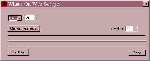
The small application that runs on your PC actually goes out to the TV
GUIDE website and 'scrapes' the TV listing data off the web and then
converts it to a text file that is then transferred to your PDA via a
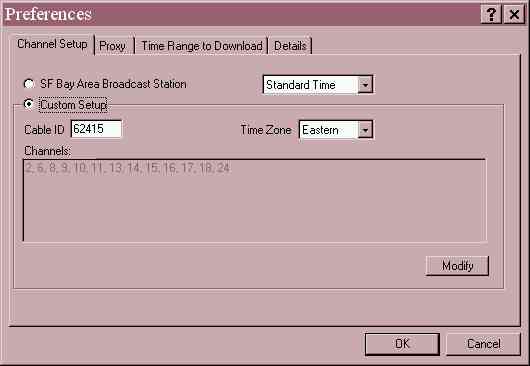
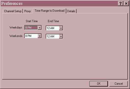
conduit. The web scraper is a simple program that allows you to specify how many
days and what block of time that you want to scrape for weekdays and weekends.
For example, you can tell the program to get listings for the next 5 days for
the hours between 7pm - 10pm on the weekdays and 8pm - 12am on the weekends. You
also tell the scraper which channels you want to get data for. Setting
this program up is pretty easy. The only bad thing about the program is that you
have to manually run it every time you want to collect new listing data. And,
depending on how many channels, days and hours that you specify, downloading
this data can take quite awhile. As an example, I usually collect 7 days (8pm -
12am) worth of listings at a time and the file size for this amount of data is
around 100k.

Once you have scraped the data, you just sync. The conduit looks in the
appropriate directory and will sync the listing data whenever it is newer than
the data on your PDA. Next, you run the What's On application on your PDA. The
program shows you a grid view of the shows for a specific day. Each line of data
is for a different channel. At the top of the screen is a typical day selector
gadget that you can use to tap on the day that you want to view. Navigator arrow
buttons at the bottom of the screen let you scroll thru the grid. Your hardware
up/down buttons also let you scroll up and down thru the grid. I wish there was
a option to use the Address and To-Do buttons to scroll left and right thru the
grid.
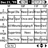
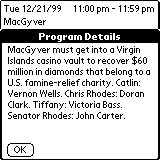
The grid displays the partial title (whatever can fit in the box) of the
show. To find out the show details, you can hold the stylus on the show's grid
box. This will pop up a small box at the top of the screen that will display the
entire show title, date, time and duration of the show. If you want even more
detail, you can tap on the little 'i' in upper right corner of show's grid box.
When you do this, the small detail box pops up as before, but then under it is
another larger box that has the show's description. I always use this feature
and think it should be the default. I find it a little hard to get my stylus on
the little 'i' to popup the details screen. One thing that the full detail
screen needs is a scroll bar. Either that, or make the hardware scroll buttons
work on this screen. If the full details are more than one page in length, you
have to use your stylus to select the text and then pull down to scroll to the
bottom. I find this a clunky way of doing things as it actually highlights the
text and really looks ugly.
I only found one real bug in the current version of What's On. If you collect
data between a certain time block for example 7pm - 9pm, and a 1hr show started
at 6:30pm, the title of that show in the grid view is shown as garbage.
Basically, that's all the features of What's On. I like the program and use it
everyday, but I wish it had some extra features that could / would make it even
better. It would be great if it had an option to display the listings in a list
view either by channel or time. It would also be nice if there was an option to
let you set an alarm to remind you of your favorite show while inside that
show's detail popup. I'd also like it if there was a preference to tell the
program to start displaying the shows at a desired time. I collect data from 8pm
- 12am and every time I start What's On, it always starts the grid view at 9pm.
This gets annoying. And last but not least, the program needs some searching
features. You can use the built in FIND app by pressing the silkscreen button,
but this searches all apps, not just the listings in What's On.
How does What's On compare to using Avantgo to download GIST TV
listings? I really like the grid format of What's On better than just the
text listing of GIST TV. I also think that the show descriptions have more
detail using What's On. I used to use Avantgo and GIST TV but since What's On
came out, I deleted that channel on my Avantgo setup.
If you are a TV nut, you really should check out What's On. It's a neat little
program that has lots of potential. At $20, it does seem just a bit high
considering the current feature set... Hopefully Zookware will read this review
and consider my suggestions. You can download a demo from their website.
Price: $20
Pros:
Easy way to keep track of your favorite TV shows.
Easy to use.
Cons:
Needs more features.
Doesn't interface with Datebook.
| Let me know your comments
on What's On and read what others have to say. |