| Gadgeteer Hands
On Review : Palm Tungsten T3 by Julie Strietelmeier Date: 10/01/2003 Let us know your comments on this review and read what others have to say. |
Product Requirements:
Windows 98/ME/2000/XP
Mac 9.1 or higher/Mac OS X ,
version 10.1.2 to 10.2.6
Close to one year ago, Palm introduced us
to the Tungsten|T, their first
hi-resolution (320 x 320 pixel) PDA. Both Judie and myself were impressed
enough to make this squatty Hobbit of a device, our 'daily driver'. That was 11
months ago... Not only has Palm changed their name to PalmOne, now Judie is
using the Sony CLI� NZ90 and I have recently migrated back to the Pocket PC and
am using the HP2215. I held on to the
Tungsten|T a little longer than Judie did, but in the end, we both wanted more.
More what? Mostly, more screen real estate.
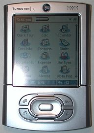
Palm has had to play catch up to the Sony CLI� for 2 years now. Sony released the first 320 x 320 pixel PDA way back in 2001 with the 710C. Then last year, they introduced the NR70V, the first Palm OS PDA with a 320 x 480 pixel display, soft graffiti area and an integrated camera. Well, here we go again folks! The Tungsten|T3 is Palm's first PDA with a 320 x 480 pixel display, and virtual graffiti area! All I can say is about time!


While Sony tends to be the gee whiz king of PDA innovation, Palm has always been much more conservative. The rivalry between them is reminiscent of the Tortoise and the Hare. Will slow and steady win this race? Read more about the Tungsten|T3, and decide for yourself...
Hardware Specs:
Processor: 32bit, 400MHz Intel Xscale
Operating System: Palm OS software version v.5.2.1
Memory: Total 64 MB (51.6 MB available)
Display: TFT color display with backlight, 320 x 480, 65,000 colors
Interface: USB (for HotSync� operation), Infrared, Bluetooth�
Dimensions and Weight: 4.3 (closed, 5.2 open) x 3.0 x 0.66in, 5.5 oz.
(including stylus)
Power: 120VAC, 60Hz
Battery: Lithium-ion polymer rechargeable battery (internal - non user
removable)
Expansion: SD card slot (Secure Digital), supports MMC and SDIO cards
Impressions:
Included in the Tungsten|T3's packaging is the handheld itself, the charger
cradle, AC adapter, leather screen cover, installation CD-ROM, and instruction
manuals.
When I first opened the box and removed the T3, I thought it looked thinner and
felt smaller than my T|T. I also thought the lighter silvery color was attractive.
The T3 is indeed a little thinner than the T|T, but it is also longer than the
T|T. In hand, it feels solid and comfortable and has the same heft as the T|T,
which I like. When I performed my standard creak test on this new unit, I did
notice some flexing and creaking around the hotsync port on the back of the
device. I notice this same slight flexing every time I pick the T3 up. Most
people will probably not notice this though, as I tend to be extremely picky.
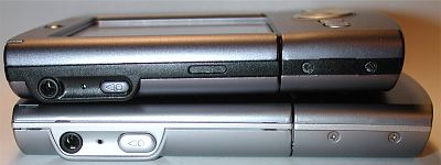
Top to bottom: Tungsten|T, Tungsten|T3
The physical design of this new PDA is very similar to the T|T and T2, but with a few subtle and not so subtle differences. Like I mentioned above, the T3 has a silver metallic shell. My guess is that the material is aluminum. The finish has a matte texture which thankfully does not show finger prints or smudges when handled.
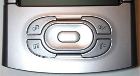
The most notable physical difference between the T3 and previous incarnations is with the new application button / navigation pad layout. The buttons are now arranged in an oval configuration around the 5-way navigation pad. The buttons are a nice size, easy to press and have good tactile feedback. The navigation pad is no longer round, but oval. The select button in the middle is now larger, which is nice. But the outside 5-way pad feels a bit awkward to me. Pressing left or right isn't a problem, but when you press up or down, you do not get much tactile feedback as the button doesn�t have as much travel. For me, this makes action game playing somewhat difficult. I really prefer the old style button layout looks and function.
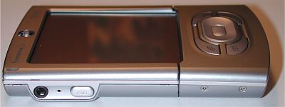
The left side of the PDA has the voice recorder button, microphone and earphone jack. Although this layout is the same as the T|T and T2, the voice recorder button on this new model is larger and not as recessed. Where I never had a problem accidentally activating the button on my T|T, I seem to continually do on the T3. Luckily, a new HOLD feature has been added to the OS. This will allow you to lock all buttons automatically or manually depending on your preference.
Sound quality on the T3 is actually very good through earphones (sorry, Palm didn�t throw in a free pair of ear buds�). Volume levels through the speaker are VERY loud. No one should sleep through an alarm on this baby! However, I�m disappointed yet again that Palm failed to allow for polyphonic alarm sounds. I was really hopeful when I heard the new �improved� deedle-dee sound upon my first hotsync. But then my hopes were dashed when I saw the same boring 6 alarm choices to pick from. Come on, it doesn�t take a lot to make me happy! I just want to hear some funky alarms!
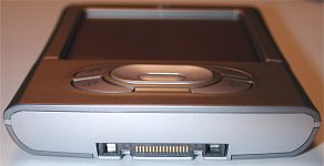
The top of the T3 is basically the same as the T|T, with the power button, stylus silo, IR port and SD card slot. IR strength appears to be stronger than previous models. I was able to beam addresses to my Tungsten|T up to 8 ft. The SD slot is an SDIO slot which means you can use SD accessories other than just memory cards. The stylus is the same as the T|T and T2. It�s actually my favorite PDA stylus. The weight and size are perfect for me.
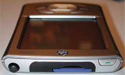
The bottom of the T3 has the familiar universal connector, so all the standard accessories, cables, keyboards, etc. will work fine with it. The same cradle that ships with most Palm PDAs is also included with the T3.
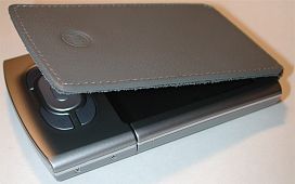
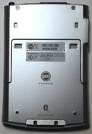
The back of the T3 is slightly different than the T|T. There are now two new attachment points for the included leather / suede screen cover. I was disappointed that Palm decided to ditch the plastic snap on screen cover. I don't care for the leather cover as there is nothing to keep it from flopping open. Actually, mine won't lay flat at all. It totally reminds me of my old Sony CLIE T615C.
One thing missing from the back of the PDA which I really wish had been included is access to the reset hole while the PDA is compressed. Like the T|T, you have to slide open the bottom of the PDA to expose the switch.
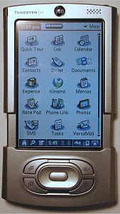
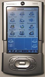
Like the T|T and T2, the T3 has the same slider mechanism. The slider on the T3 is slightly stiffer than my T|T. I doubt if there is anyway it would fall open or closed on its own. With the previous models, the slider was used to expose the silk-screened graffiti area. Not so with the T3... this model does not have a dedicated graffiti area. Instead has a soft input area that can collapse out of the way to reveal the new 320 x 480 stretch display. Of course, Handera first introduced the soft input area in their 330 model over two year ago.
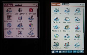
Left to right: Tungsten|T, Tungsten|T3 both set and highest
brightness setting
This is Palm�s first PDA with a 320 x 480 pixel hi-res display. And what a gorgeous display it is! It makes my old T|T look murky and tiny. When the slider is open and the screen is completely exposed, it is 3.25 x 2.20in with a diagonal of 3.87in. 50% larger than any Palm branded PDA to date. It is extremely bright and crisp with vivid colors. At the half brightness level it is very comfortable to read. Heck, even turning the brightness completely down to the lowest setting is adequate in most light. Maybe I missed it, but I was surprised to find that I couldn�t turn the backlight completely off. Even in the RealOne Player application, you have to give it a timeout period before the screen blanks. I�d rather have a button press option.
More about the new display features in the software section of the review...
The battery life on the T3 is less than my T|T. I guess with the faster
processor and larger, brighter display, there had to be a catch right?
As far as over all system performance, the T3 is a regular speed demon. So far, I�d have to say that it is the fastest Palm OS PDA that I�ve used to date. With its 400mhz processor, I don�t think anyone will have any complaints about program start up time with this device.
Hardware-wise, I�m satisfied with the T3. I�m not overjoyed though. I can live with button layout and battery life, but I�m personally tired of the slider. I want to have access to the full display ALL the time. That�s really why Judie went to the Sony CLIE NZ90. I was very tempted to do the same thing, but the price and bulkiness of it were prohibitive to me, so I want back to the Pocket PC. Don�t get me wrong, the T3 is cool, very cool� But I would just rather have a solid non-expanding PDA.
That said; let�s go on to the software part of the review.� Not only did Palm mix it up with some new
hardware features, but they also added quite a few goodies to the OS to enhance
them even further.
Software Specs:
The Palm OS version on the T3 is v5.2.1. This version includes quite a few
updates that Palm users have been waiting a long while for. The applications
included in ROM are:
Core
Functions
Contacts � This used to be called Address Book, but the name has
changed to better match the same PIM applications in Microsoft Outlook. I think
Palm realized that a large percentage of their user base syncs with Outlook and
not their own desktop application. Some of the changes in this new version of
Contacts include the addition of a website field, instant messenger name field,
work and home addresses, and a birthday field with a reminder option.
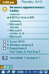
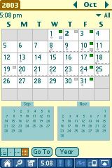
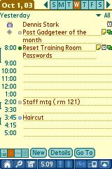
Calendar � Of course, this used to be called the Date Book. Some of the new
features include an updated Agenda view that looks very similar to the Today
screen on a Pocket PC. It lists your upcoming appointments, Tasks and Email
info. The month view now includes small views of the previous and next month
(in full screen mode). Events can now be categorized, categories have their own
color bullet next to them in the date view, and you can add a location for an
event. Also, events can now span
Tasks � Was the To Do List application. Not much has changed with this application except for the addition of alarms per task and the ability to view by due and past due settings.
Memos � Was Memo Pad. Can I get a drum roll please? Ok everyone, hold on to your hats� Are you ready for this?� I�m warning you, this will come as a shock� Palm FINALLY fixed the 4k size limit on memos! Wheeeeeeeeeeeeeeee! Better late then never right? Other than that major change, the Memo application (not sure why they didn�t name it Notes to match Outlook) remains unchanged.
Calculator, Expense, Hotsync, Note Pad, World Alarm Clock, Voice Memo - Remain unchanged from previous OS versions.
Card Info - Displays data about the SD memory card in the slot.
Still missing from the core apps is a file manager and a backup / restore app. Come on Palm!
The other major changes to the OS have to do with the new hi-res screen and soft input area. The input area is collapsible in most, but not all views and applications. Along the bottom of the display there is a new status bar with several tools. The rightmost button is the one that will allow you to collapse the screen. From left to right, the buttons are: Home, Find, Menu, Time, Attention Manager, Bluetooth, Full-screen writing, Screen rotator, Soft input toggle.
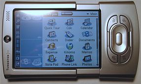
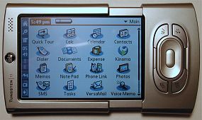
The Home button will take you back to the application launcher window. Holding it down will popup a pick list of the last 6 applications that were last accessed.
The Find button is the same finder dialog box that we all know and love. The Menu button function is the same as always too.
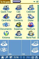
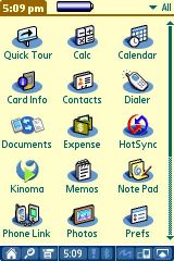
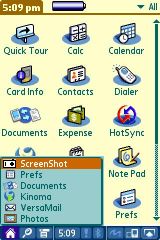
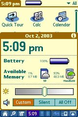
The Time button is a new addition. Clicking on it will bring up a status window that shows you the time, battery level, available internal and SD card memory, screen brightness level, and volume level. I like the volume level adjuster as it gives you a quick way to silence all alarms. This is a great option to use right before going into a meeting.
![]()
The Exclamation button is the Attention Manager. It gives you fast access to alerts.
The Bluetooth button gives you quick access to the Bluetooth radio settings.
The Full-screen writing toggle button gives you Jot or Graffiti Anywhere features. When it is turned on, you can write anywhere on the screen instead of just in the soft input area.
The Screen rotator button is one of my favorite features. A quick tap will instantly rotate the screen clockwise or counter clockwise depending on your handedness setting. Landscape mode on the T3 is wonderful, especially in database and spreadsheet screens.
Communications
Phone Link, Dialer, and SMS � Mobile phone apps.
VersaMail � Latest version allows you to view Word and Excel attachments (up to 5mb in size).
Multimedia
Kinoma � Video player. I�m still not as impressed with Kinoma as I am
Media Player on the Pocket PC. I don�t care for the fact that I have to convert
the movie to a different format before being able to play it. Kinoma movies are
still not as smooth as MPEG movies on a PPC.
Photos � Slideshow application. Pictures look great in full screen mode!
RealOne � MP3 player. Does the job, nothing fancy.
Productivity
Documents-to-Go � Word, Excel and PowerPoint viewer and editor.
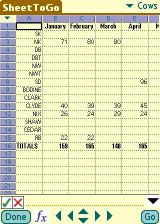
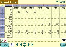
With the landscape feature, you can see quite a few more rows in an Excel spreadsheet.
Bonus Software (included on CD)
Java 2 Micro Edition - Run java apps on your PDA.
Adobe Reader � PDF file viewer.
Palm Reader � My favorite e-book reader! Now with the larger screen, it feels like I'm reading a real book. Landscape mode is especially nice.
powerOne Calculator � What the built-in calculator should be.
BlueBoard, BlueChat � Bluetooth apps.
RealOne Desktop
Kinoma Producer � Desktop application that allows you
to convert your favorite home movies and animated videos - MPEG-1, QuickTime, AVI - to a format you can view on your handheld.
Solitaire � The classic card game from Handmark that we all know and love J
Web Pro � Web browser.
Conclusion:
The Tungsten|T3 is the nicest Palm OS PDA that I've had the pleasure to use for
any length of time. With its fast processor, gorgeous display, solid software
package, and decent price, it is almost perfect. If I were in the market for a
new Palm OS PDA, and definitely needed the larger format display, this would be
one that I would take a long hard look at before flashing my credit card.
That said, as both a product reviewer and a consumer, it sometimes feels like technology is moving quickly and slowly at the same time. No sooner does my bank account recover from buying one new PDA, when yet another batch of devices are unveiled with enticing features that beg the question: Should I upgrade? That's the quickly aspect of the equation... On the other hand, time continues to drag on as I wait for that one PDA which will incorporate all the features important to me, making it my perfect device. For me, the perfect Palm OS PDA would be a T3 that doesn't hide half of its face under a slider mechanism, has 128mb of RAM, WiFi and a better battery. The T3 comes close, but I think I'll continue the wait a little longer...
Price: $399 Search for the best price here.
Pros:
Virtual Graffiti area - finally
Hi-res screen
Fast processor
Easy screen rotation
Cons:
Have to open the slider to see full screen
Lack of file manager application
| Let us know your comments
on this review and read what others have to say. Back to Main Page. |