

| Gadgeteer Hands
On Review : Sony CLIÉ PEG-UX50/U by Judie Hughes Date: 09/29/2003 Let us know your comments on this review and read what others have to say. |
Product Requirements:
Windowsź 98 Second Edition, Windowsź
Millennium Edition, Windowsź 2000 Professional, Windowsź XP Home Edition,
Windowsź XP Professional, CPU: Pentiumź II 400 MHz or faster
(Pentiumź III 500 MHz or faster is recommended), Available Memory: 96 MB RAM
minimum (128 MB or more is recommended. 256 MB or more is recommended with
Windowsź XP.), Available hard disk space: 200 MB minimum (350 MB or more is
recommended)
How many of you remember the Only in Your Dreams PDA Contest that The Gadgeteer held back in 2001? The second prize winner, Danny W. S. Whang, submitted an entry that looked like this:


I really loved his design, and my comment at the time was, "If Danny would have added a bit more memory and a soft graffiti area, I would be very tempted to buy this PDA if it were available today..."
Until now, the only PDA with anything even remotely resembling this design was the Zaurus c760. Unfortunately, I am just too heavily invested in software for both the Palm or Pocket PC OS to be able to voluntarily make the switch to Linux. So I have been patiently waiting for one those two platform's licensees to take pity on me and produce my mini-laptop.
For some time, Sony has been the only Palm or PPC OS manufacturer to offer any clamshell keyboard devices. But as much as I liked their innovative PDA designs, they still didn't have quite the form factor I was looking for. Instead of a horizontal keyboard model, they were making vertical keyboard models. While these PDAs, which include their CLIÉ NR, NX & NZ series, all offered beautiful virtual graffiti screens and many different options such as cameras, Bluetooth and 802.11b wireless, I personally found their vertical keyboards too awkward to use for any length of time - I always went back to graffiti, keeping the PDA screen folded open in tablet/portrait mode. Even though owning one of these models required carrying a larger PDA than I might have otherwise, it was a fair trade-off because of the features I got in return.
When news came down the pipeline about an upcoming horizontal keyboard model CLIÉ with virtual graffiti, a built-in camera and Bluetooth as well as built-in 802.11b, Julie and I dusted off our credit cards and put in our pre-orders. Would the Sony CLIÉ PEG-UX50/U be the PDA I had been waiting for all of these years? Would the keyboard be as useable as I had hoped? Or would I just end up using the PDA in tablet mode the majority of the time? Would the screen be just as wonderful as Sony's other 320 x 480 virtual graffiti screens? Would I even want to keep the PDA after reviewing it?
Sony is actually offering two CLIÉs with this mini-laptop configuration, the UX50 and the UX40. The main differences between the two models are that the 50 has WiFi (in addition to Bluetooth), it costs $100 more, and it has a metallic silver case whereas the 40 is gunmetal grey. Otherwise, they are essentially the same PDA. Since my home has a WiFi network, I was more interested in the UX50.
Interestingly enough, whereas the box for the PEG-UX-50 says "Personal Entertainment Organizer," the Sony site calls it a "Mobile Internet Communicator." I guess this is so that none of us mistakes these new CLIÉ's for a lowly PDA.
I am the first to admit that I had a lot of expectations for the new UX50. Did it live up to them? Let's take a look...
Initial impressions:
Included in the UX50's package were the CLIÉ handheld itself, the charger cradle, USB HotSync cable, retractable stylus (more on this toothpick later), AC adapter, hand strap, installation CD-ROM, instruction manuals, End User license agreement, Graffiti2 card, and the Limited Warranty statement.
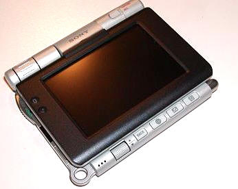
Bear in mind that since I use a CLIÉ NZ90 everyday, I am used to a larger sized PDA. So when I opened up the UX's box my first thought was, "Oh it is so cute and tiny!" Just looking at the metallic clamshell exterior, and knowing what the PDA was supposed to be capable of from reading its specs, I was already feeling impressed.
Then I opened the lid and got my first look at the screen...not a total disaster size-wise, but it was certainly smaller than I had expected. As if to make it seem even smaller, there was a thick black plastic border around the 2.74" (6.96cm) wide x 1.84" (4.67cm) tall screen. For comparison, the average business card is 3.5" (8.8cm) wide x 2" (5.1cm) tall.
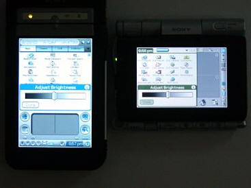
After charging the CLIÉ, I was a bit concerned because the first time I powered it on the screen was not backlit - in fact it was almost impossible to see anything. It was as if all I could see was a light ghosting of the familiar Palm welcome/set-up screen. I did a soft reset and that took care of the problem, revealing a bright, beautiful high resolution screen. I had heard rumors that the screen was not that bright, but when kept at about mid-point on the brightness slider, I found that the screen looked great. Here is an un-retouched screenshot comparison of my NZ to the UX. Both are set at the same point on the brightness slider, and as you can see the UX is holding its own.
Before I go into much more about my experience with the UX, let's take a look at the hardware...
Hardware Specs:
Processor: Sony CXD2230GA
Operating System: Palm OS software version v.5.2
Memory: Total 104 MB (16 MB available for storage of files and programs.
Additional 16 MB available for system back up. Additional 29 MB available for
media storage)
Display: TFT color display with backlight, 480 x 320 dots; 65,536 colors
Interface: USB (for HotSyncź operation), Infrared (IrDA 1.2), Memory Stick slot,
Bluetooth, Wireless LAN (IEEE 802.11b WiFi)
Dimensions and Weight: Approx. 4 1/8 x 3 œ x 23/32 (projecting parts not
included), Approx. 6.2 oz. (including stylus)
Power: Output: DC 5.2VInput: AC 100V 240V
Battery: Lithium-ion polymer rechargeable battery (internal - non user removable)
Expansion: Memory Stickź media (recognizes Magic Gate & Memory Stick Pro cards)
As I previously mentioned, the UX50 has a silver metallic shell, quite similar to the magnesium shell on my NR70V. The metal gives the CLIÉ a substantial feel, without making it feel too heavy. For comparisons sake, my NR70V weighs 7.2 ounces (204g) while the UX50 weighs just 6.2 ounces (172g). The UX50 actually weighs just 0.1 ounce more than the Tungsten T (with plastic screen protector on). In fact, to go a step further, the NZ90 that I normally carry everyday weighs 10.3 ounces (293g); so you can see that the UX50 is a light-weight in comparison.
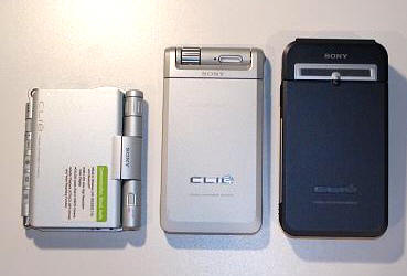
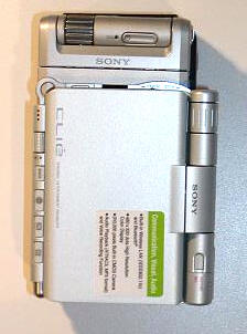
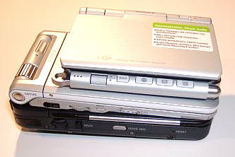
From left to right: the UX, NR and NZ. Top view: the UX, NR
and NZ. Side View: the UX, NR and NZ
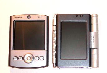
Side by side, the Palm Tungsten T and the UX
This PDA feels solid as a rock - even the swiveling screen feels tight, not the least bit wobbly or loose. It passes Julie's famous creak test with flying colors.
Looking at the unit when it is closed, you can see that the screen portion - or top half of the PDA - does not meet evenly with the bottom portion.
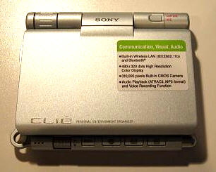
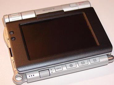
This leaves the bottom buttons exposed when the screen is in tablet/landscape mode. These buttons are from left to right: the jog-dial, Back button, Web Browser, E-mail and Date Book. Of these, the Web Browser, E-mail and Date Book buttons are re-mappable. To the left of the jog-dial is the microphone, and continuing to the left is a large loop for those that prefer to keep their PDA on a lanyard (one is included in the box). The jog-dial on the UX is almost better described as a "jog-wheel," in that it reminds me of the paddle wheel on a riverboat. The jog-dial is wide, barely textured, and inconveniently placed for one handed operation. I have managed to read two complete e-books while testing the UX, and I gave the jog-dial a fair chance - but I dislike it strongly.
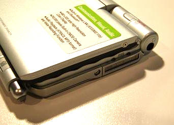
The right edge of the CLIÉ contains from left to right, the stylus silo, the Memory Stick Pro slot, and the headphone jack.
While we are in this area, I should mention that the stylus that comes with the UX is a retractable toothpick that I would only recommend using when you have forgotten your full-size stylus. it appears to have been designed with nothing more in mind than the briefest of entries or screen taps. Using it for any amount of time is guaranteed to bring on a bout of hand-cramping; I think this is easily one of the worst stock styli I have even used. Perhaps since this is a PDA with a built-in keyboard, the stylus was considered more of an afterthought than it might have been on a traditional handheld. In any case, I suggest you keep a good multi-pen handy when using the UX.
When closed, the stylus measures 2.5", and when opened it is 3.7". I found that when carrying the CLIÉ, the stylus would try to pop out of the silo at will, sometimes by as much as 1cm. Even though the stylus hasn't actually fallen out yet, it appears to be only a matter of time before it does.


I should also mention that in case you didn't already notice it in my list of contents, the UX does not come with a set of ear-buds. I thought this was a bit chintzy of Sony, especially given the price of this particular high-end CLIÉ.
Moving right along...
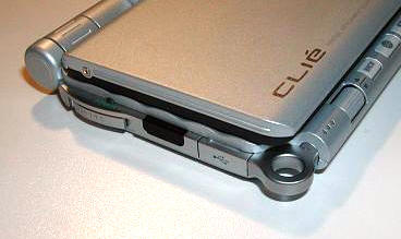
The left side contains the Hold/Power sliding button, the Infrared port, the mini-USB port, and the previously mentioned lanyard loop.
Considering the fact that this is a landscape oriented screen, I wonder why Sony didn't keep the jog-dial on the upper left, like it is for all of it's other PDAs. It would have been perfect for one-handed operation - scrolling through e-book pages and other items, but instead, they did this combo power/hold slider. The power is turned on by sliding down, and turned off by sliding down again. Hold is achieved by sliding the bar straight up to a locked position, and it is released by sliding the bar back down.
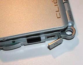
The mini-USB port is covered by a plastic tab on the end of a rubbery dongle. While I think it is great that there is a cover for this port and that this isn't a loose piece waiting eventual misplacement, the dongle is a bother and gets in the way when attaching the mini-USB. I would have much preferred it if there could have been a way to integrate the mini-USB port into the cradle and not into the PDA, just because it is such a hassle. Since the only time you need to use this port is when hot-syncing, it might be in your best interest to quickly figure out how to sync wirelessly - either through the use of Bluetooth or WiFi. Perhaps in the future there will be peripherals that use this mini-USB port on the UX. When/If that time comes, I may rethink whether its location is still inconvenient or not; but for now, I believe it is.
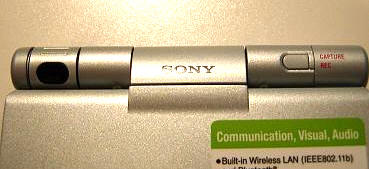
Like the NR70V, the camera lens located at the top of the UX rolls to provide its own protection or for ease when looking at the screen and capturing pictures or video. More on these features later...
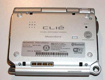
The back of the UX has the speaker and a reset button that you can access with the tip of a stylus. I always like it when a PDA has a nicely sized reset button, as I hate having to unscrew a stylus to get to the reset pin.
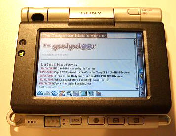
When the screen is flipped up in laptop mode, or laid back in tablet mode for viewing, you can see the LED lights on the border that designate when Bluetooth or WiFi are being used.
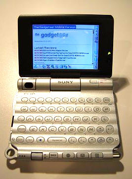
The UX50's qwerty keyboard is very nice, definitely a much easier to use size than the vertical models. I got a couple of pleasant surprises with this keyboard: the first being that it lit up with an orange backlight when being used, and the second being that it included numbered buttons - which neither my NZ nor my NR series CLIÉs have. There is not much differentiation between the keyboard buttons and their pad, but the keys are set on the crest of the "ripples" that comprise the background off the keyboard. This raised placement as well as the lighting helps make the keys easier to use.
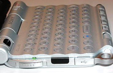
The buttons make a nice light click as they are pressed, and double index finger typing is actually quite speedy. I would like to see the tab button actually move between fields in future models, instead of just scooting down the line. However, I am not sure if this is an OS issue or just a programming detail. It would also be nice if capital letters could be achieved by a longer press of a key, instead of having to to hit the shift button. Things like that would make using such a little keyboard a much better experience, in my opinion. It is a nice feature that by hitting the shift key once, you get a single capital letter. If you click it twice, it performs a "caps lock" allowing multiple capitals in a row.
Another cool feature that has been added is the use of the Control button in conjunction with a keyboard number to launch a designated application. The designated application can be set in preferences.
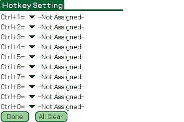
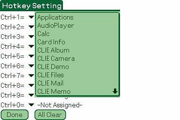
Overall, I like the size of the keyboard, and I much prefer it to the versions on the NR and NZ. The keyboard is much easier to use, and I especially like the new numbered keys. However, I found that for most data entry, I still relied on graffiti. In fact, over the time I have been reviewing this unit my keyboard usage has dwindled to almost nil. I think this is mainly because I have became more proficient in Graffiti2.
The last piece of hardware I would like to discuss is the cradle, or perhaps I should call it the "sled." Unlike the traditional cradles that prop a PDA upright, the UX series comes with a 3" x 4" sled into which the CLIÉ snaps.
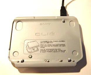
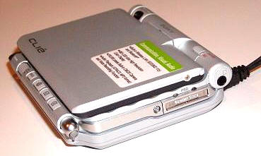
The power cable plugs into the sled instead of the PDA (unlike the mini-USB for syncing). I don't like the fact that in order to charge the CLIÉ while traveling, I will have to lug that sled along. Any aftermarket charger that you buy will only be able to plug into the sled, as there is no slot on the back of the UX for one to attach. If I had had the choice of putting either the sync or charge port on the actual body of the UX, I would have definitely chosen the power-port..
I found the UX50's battery life to be fair during the last week and a half that I have been using it. Anytime one uses WiFi for an extended period, especially with a backlit screen, it is expected that battery life will be sucked dry rather quickly. In my tests, I found that I could get almost 3 hours use before hitting 20%, with the backlight set to middle brightness. For simple e-book reading, the battery lasted for almost four hours before it fell to 25%, with the backlight set to medium.
One battery feature that I wish Sony would have added to the UX is the Smart Lithium Battery Information screen that my NZ has. It tells me the how long I have used a battery, as well as how much time is left. It also keeps track of how many charge cycles my battery has been through and how much degradation if any, there is to the battery. All the UX's battery screen tells me is how much life is left by percentage. I feel let down, when I look at this measly information. There is an extended battery pack that you can buy from Sony, which is supposed to triple your original battery life. Of course, it also adds a great deal of bulk to the UX50 - but if you need it, you'll buy it.
Software Specs:
One of the most exciting features exclusive to this new PDA (at the time of this review's release) is the landscape oriented screen. There are quite a few applications that would greatly benefit from this view, and it would seem that web browsing would be one of the most obvious areas in which the UX would shine. Unfortunately, many of the programs that would most benefit from the landscape orientation do not yet support it. I am thinking specifically of products like Documents to Go, Quickoffice, HanDBase, and the like. Thank goodness PalmReader Pro automatically works in landscape, or I would have been in trouble!
While many programs have adjusted their views to include the 320x480 high resolution+ vertical screen of the soft graffiti PDA's, it would appear that we will have to wait a while for the 480x320 versions to begin appearing. Hopefully, it will won't be too long a wait. As it is now, being able to only view these programs in what amounts to 320x320 is like re-entering the stone age - especially once you have grown used to 320x480. Here is an example:
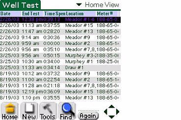
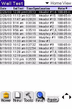
If I would have had more entries, you would have seen data all
the way down to the toolbar...
As with most Sony CLIÉ's, the UX50 comes with a nice selection of built in as well as aftermarket trial software. With that said, let's take a look at what's included.
Sony Software - while I won't discuss every program, I will touch on a few...
Audio Player - Sony's MP3 player. Interestingly enough, it is only displayed in 320x320. This was poor planning and implementation on Sony's part in my opinion - a full screen display would have been much more impressive. The UX's speaker is not really strong enough to listen to music out loud, but playback is great over headphones.
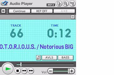
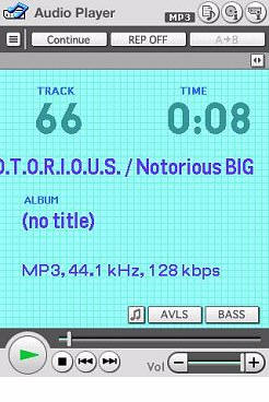
Note how the landscape version does not use the full screen,
whereas the portrait version does. This feels like a rushed, incomplete product.
CLIÉ Album
CLIÉ Camera - Software that drives the camera. The camera is a 310K effective pixel...which means it is 0.3megapixels. Obviously this is not going to replace your usual digital camera, but in a pinch it is a little bit better than nothing. Pictures can be taken in the following sizes: 640x480, 320x240, 160x120, and 320x480.
There are three zoom settings, which I have represented here...


CLIÉ Demo
CLIÉ Files - a built-in file explorer. Handy for moving apps from internal to
external memory.
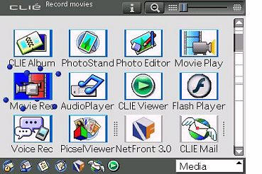
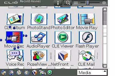
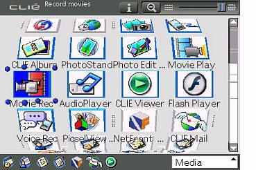
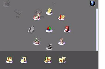
CLIÉ 3D Launcher - You can adjust the slider at the upper right until the
programs curve across the screen like the display on a one-armed bandit in
Vegas. JACKPOT! Little balls, like dancing atoms, twirl around selected items...
CLIÉ Mail - Handy e-mail program that is tied in with the camera and movie
recorder software. Extremely handy for e-mailing on the fly, either via BT or
WiFi.
CLIÉ Memo
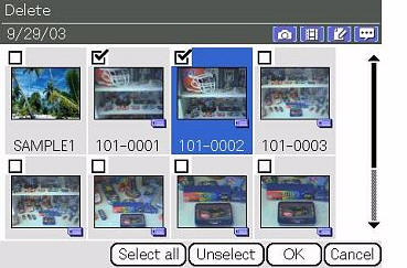
CLIÉ Viewer - View and manage internal or memory stick pictures on your CLIÉ.

Data Export v.1.0 (for PC) - Program for PC that allows you to move data from PC
to CLIÉ.
Data Import - Program for CLIÉ that allows you to turn the PDA into an external
drive. This is the primary way that I move apps or MP3s onto my CLIÉ's memory
stick, since my MS reader won't work with Pro cards.
Image Converter v.1.1 (for PC)
Movie Player - Plays the movies you record with the CLIÉ
Movie Recorder - Records movies onto your CLIÉ, complete with sound. Recording
can be done in three bit rates, V:256/A:32kbps, V:192/A:32kbps and
V:96/A:32kbps. Movies may not be extremely sharp (due to the low mp of the
lens), but the playback is extremely smooth.
PictureGear Studio (for PC)
PhotoStand
Photo Editor
Remote Camera - Allows you to set up a BT connection with an enabled camera and
control the camera with your CLIÉ.
SonicStage v.1.5 (for PC)
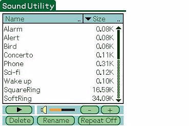
Sound Utility - Allows you to organize the various alarms that are on the UX50
Voice Recorder
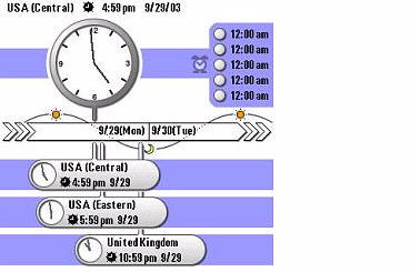
World Alarm Clock - Displays the time in 3 zones, and allows up to 5 custom
alarms to be set.
Noticeably absent is the Memory Stick Backup program that usually ships with all CLIÉ's. I could have done without something else if they would have included this! In its place are the assurances (in the manual) that when you hot-sync your files are backed up. Does that make you feel safer? Me neither. So I am doubly glad that I already use BackupMan.
Palm Organizer Applications - No organizer that contains the Palm OS can ship without at least a few of the basics. At least the UX manages to convert the top four into landscape mode. Once again, I will not comment on every program, rather I will touch on a few...
Address Book - looks great with the new landscape mode - you can even add a picture to the entry, if you would like.
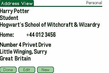
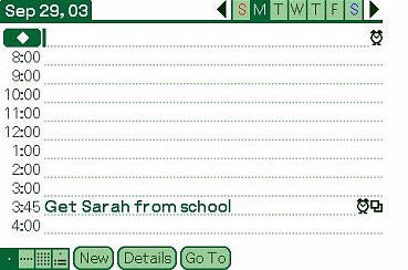
Date Book - also looks very good in landscape mode...
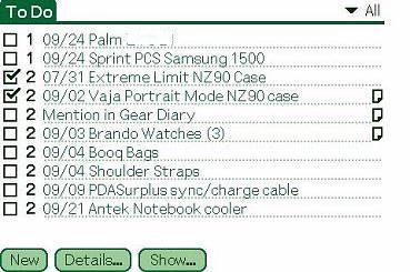
To Do List - more kudos are in order...
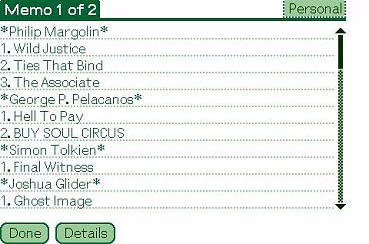
Memo Pad - and yet again...
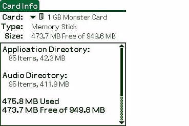
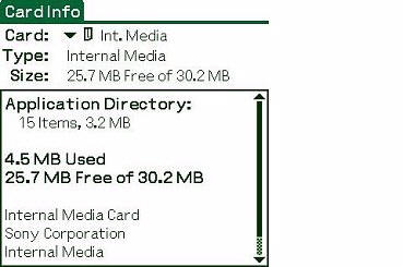
Card Info - gives data about the internal media and added Memory Stick (if
you use one)...
Calculator
Security
HotSync
Palm Desktop v.4.1 (for PC)
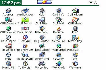
Launcher (Palm Standard Launcher) - Same old launcher, it's just in landscape
mode now...
Short Message Service (SMS) - allows you type out SMS messages on your CLIÉ,
then send them via Bluetooth over your GSM phone.
Value Added Software - Any time you see the double asterisks (**), these titles are shareware. Otherwise, they are full versions. I have added links so that you can read about the software is any given title interests you. Be forewarned, many of these programs do not support the landscape mode. Hopefully in time that will change...
AcidSolitaire**
Agendus**
BalanceLog**
Bejeweled**
Contacts Pro**
Crosswords**
Flash Player5
Insaniquarium!
NetFront -
the built in web browser
Palm Reader and sample 2 e-Books**

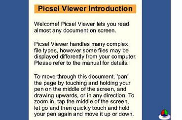
Picsel Viewer - Allows you to read (but not
edit) almost any document on the CLIÉ. Nice GUI, by the way...
PowerOne Finance**
PowerOne Personal
StreetFinderź Express**
Vindigoź**
Visto MessageXpress**
WorldMate**
**Trial version software
Pre-Installed Third Party Applications -
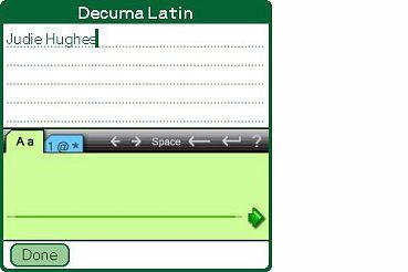
Decuma Input - Allows you to define symbols as to ten "shortcuts for lengthy
text that you enter frequently."
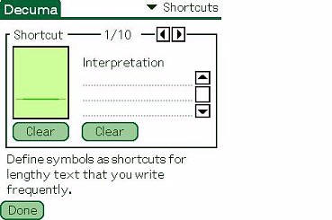
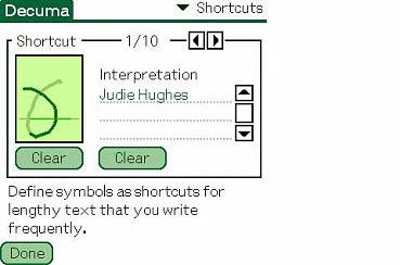
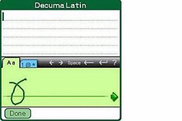
Correct me if I am wrong, but didn't Shortcuts under Prefs already do that? I thought at first that this program might be useful to help me get around some of the new Graffiti2 letters that I was having trouble with. I thought I might be able to remap them in the old way, but because of the steps involved and the way Decuma swallows up half of the 320x320 screen, I resolved to just "get over it" learn Graffiti2.
Decuma is at least, easy to use. You just enter your designated symbol on the
line, then hit the arrow. But then, shortcuts were always easy, too. Decuma is
accessed by calling up the soft Graffiti screen and clicking on the keyboard
"a", if you have Decuma set as default in it's settings.
NetFront
v.3.0 for CLIÉ
Picsel Viewer
Macromediaź Flash Player5
Conclusion:
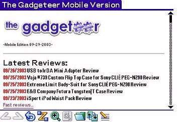
I found it interesting that while I was using the UX50, some of the programs that I thought would receive the most benefit from a landscape orientation didn't seem all that much more viewable. Witness this shot of the Gadgeteer mobile version...
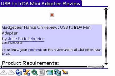
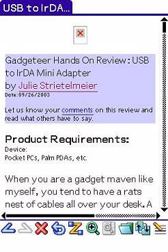
As you can see, more info is actually displayed in portrait mode - and it is just as viewable as the landscape version.
The programs that would have demonstrated the best benefits of landscape, such as Documents to Go, Quickoffice and HanDBase aren't even available in landscape format yet. In fact, so many things about this particular PDA feel incomplete, including its own built-in software, that I can't help but think that Sony was in a race to see who could market and sell the first landscape PDA. Guess what? They won! But at what cost for us as consumers? This is not an inexpensive unit, and in some ways it feels very much like a beta version - even though it is a very cool beta version..
As much as I thought I would like looking at things on a landscape screen, I found that I missed using the portrait view - especially when I had the screen swiveled around in tablet mode. If there were a software fix that would allow a user to specify when a program should be seen in portrait or landscape, then this would feel like a more complete solution. But as things are, it feels too restrictive.
While the keyboard is nice, I didn't find myself using it much more than the one on my NZ90 after the novelty wore off. I never felt comfortable with it for extended text input, and I can't imagine trying to compose a lengthy document on it.
I can live with the camera not being the greatest, but I would almost prefer having no camera to having a lame one. Perhaps I have become spoiled by the 2 mega-pixel camera on my NZ, but going back to fuzzy shots was really a step down.
Over time, in addition to the issues I have pointed out, the small size of the UX's screen and the placement of the jog-dial have become the final blow to what I thought originally might be the perfect PDA for me. To be honest, I will be boxing this PDA up and sending it back to the company I bought it from tomorrow. Perhaps a future version of this PDA will address more of the features I find important.
You can view a the Sony PEG-UX50/U Online manual and other related UX50 documents here, and any future software drivers and updates for this PDA can be found here.
Price: $699 Search for the best price here.
Pros:
Landscape screen orientation - finally
Useable and decently sized compact keyboard
Compact, solid design
Bright, beautiful screen
Built in WiFi and Bluetooth
Built in camera
Quick processor
Cons:
Expensive
Lame camera
Small screen
Lack of landscape support in native Sony and Palm software
Inability to swap between landscape and portrait mode
Jog-dial placement
Cumbersome cradle/sled
| Let us know your
comments
on this review and read what others have to say. Back to Main Page. |